Today’s post explores what has sometimes been called the future of mobile engagement, alternate reality (AR). While still in it’s infancy due to the complexity of implementing and the need for yet another app on the consumer’s part, some commercial efforts are out there. Below we experience a very rough implementation and learn how not to use AR.
_________________________________________________
Not long ago I was visiting my sister and picked up one of her fitness magazines, the September issue of Shape. I decided to thumb through it to see if there was much use of QR codes or even the ill-fated Microsoft Tag. There were a few QR codes, which I scanned of course, but there was also this on page 10:
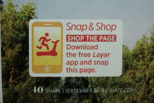
Interesting! I happened to be familiar with Layar, the developer of Alternate Reality (AR) technology, from some research my students had done a year or so ago. In a nutshell, AR uses a phone’s camera and other sensors to layer (no pun intended) a digital experience on top of an otherwise physical environment. I was going to have to download their app so I knew this wasn’t going to be a quick endeavor but I never would have thought the whole thing took as long as it did.
First, I had to get the app so I headed to Google Play, tapped in “layar” (it would have been handy to have a QR code in the magazine for this) and downloaded the app. Once downloaded I opened the app which forced me to swipe my way past 4 promotional pages to get to the Start Now! button. The time required for all this was starting to add up. With the app open I did as instructed and scanned page 10. After quite a bit of fiddling with how much of the image to include in the viewfinder the images in the viewfinder began to glow with a blue outline. It continued to glow for quite awhile (tick-tock, tick-tock) when a rotating gear showed on the screen. I don’t know what it is or what it means but it was rotating on my screen for a very, very long time.


Just as my patience was getting short the spinning gears gave way to a little blue button inviting me to “Click for More Details”.
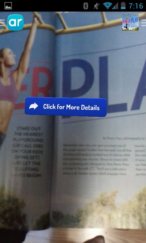
What? No fancy 3D graphics or cool animation of the model? All this for a frigging button??
And details on what? I scanned the entire 2-page spread, what exactly am I to get details on? Confused, I tap the blue button and the Layar app presents me with a selection of women’s clothing from Macy’s. None of which appeared to be the items worn by the model in the magazine.
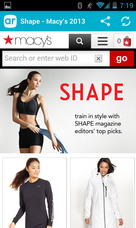
Perhaps the sports-bra thingy was the same but it was a different color and on a different model – this one brunette rather than blond. The pants and shoes on the model in the magazine were nowhere to be found. Where are those details??
At this point I was several minutes into this little experiment and my sister had wandered off having been ignored the entire time.
FAIL.
********************************************
What could have saved this campaign?
Overall this was a ridiculous exercise in technology that did nothing that a QR code couldn’t do. The point of AR is to create a more engaging experience. That’s the payoff. I’m not sure who was really driving this experiment, Layar or Macy’s, but here’s what needed to happen.
1) Use a QR code. If all you want to do is present people with an opportunity to shop then use a technique that people are likely to be familiar with and for which they are already equipped. Readers of Shape probably know how to scan a QR code and it is certainly more likely they have a QR scanning app than a Layar app.
2) If asking people to download a new app, familiarize themselves with it, and learn to use it in order to “Snap and Shop” there had better be a dazzling payoff. Layar or whomever handled the technology side of this needed to animate the page in some way. For example, they could have had pop-out bubbles that pointed to each clothing item and gave details on that item. Tapping the bubble could then take you to that item on the Macy’s page.
3) Finally, the landing page needed to have only the items featured on the page I scanned. What else would have caused me to scan the page to shop? Mobile is about impulse so it needs to be quick and simple to satisfy the desire someone might have to wear what the model in the magazine is wearing. Sure, let me keep shopping if I want to but keep the page focused on the items featured. Then, use the same model in the shopping experience as used in the magazine to create even more continuity.

